Annotated Feature Layout
A tilted device with a side callout chip linked by a connector line. The educate layout for pointing at one specific feature.
Try this layout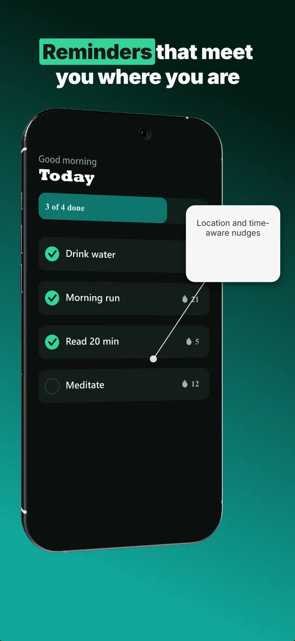
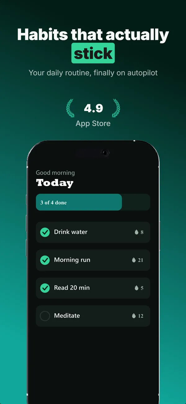
What is the annotated feature layout?
The annotated feature layout angles a device to one side and draws a callout chip connected by a thin line to a specific point on the screen, the way a product diagram labels a part. Its narrative job is educate: it isolates one feature and says, in effect, "look here, this is the thing." The tilt adds energy and makes room for the chip, and the connector forces the eye from the label to the exact UI element it describes. Use annotated feature when a single capability is your differentiator and it lives in a specific spot on screen that a plain caption could not pin down. It reads as more designed than a flat text-top layout, so it suits creative, productivity, and tool apps where precision matters. Keep the callout to one short phrase, because the layout is built to highlight a single feature, not to narrate several at once.
Layout spec
- Narrative job
- Educate
- Device mockup
- Yes
- Works in frames (of 5)
- 12345
- Renders
- Press banner
Read from the builder engine: the narrative job, device, valid frame positions, and trust signals this layout actually renders.
When to use this layout
Use annotated feature when the feature you are selling is a specific element on the screen and you want to point straight at it. If you are explaining a whole screen or a broad benefit, a text-top device layout is cleaner. One callout per frame; multiple chips and connectors turn into clutter fast.
Best for
- Educate frames spotlighting one specific on-screen feature
- Apps whose differentiator lives at a precise point in the UI
- Creative, productivity, and tool apps that suit a designed feel
- Frames where a plain caption cannot point precisely enough
Common pitfalls
- Adding multiple callouts, which tangles the connectors and loses focus
- Writing a callout too long to read at thumbnail scale
- Pointing the connector at empty space instead of a clear UI element
Generate a annotated feature screenshot
Describe your app, and the builder generates a frame in this layout. No design decisions, just finished output.
Get screenshotsRelated layouts
educate
Text-Top Tilted
Headline at the top, device rotated 15-30 degrees for dimensional depth. Same educate role as text-top-device-bottom, but adds visual energy.
educate
Feature Grid
A 2x2 or 2x3 grid of icon-and-label tiles, no device. The depth layout for showing four to six features in one frame.
educate
Text-Top Device-Bottom
Headline at the top, flat device anchored at the bottom. The default educate layout for frames 2 and 3 where feature explanation has to land before the scroll-off point.
hook
Device Hero
Centered flat device with a strong headline above. The product-forward hook layout: frame 1 is the one screenshot almost every App Store visitor sees before deciding.
Want the full set strategy?
Read the 7 layouts that convert in 2026 guide