Feature Grid Layout
A 2x2 or 2x3 grid of icon-and-label tiles, no device. The depth layout for showing four to six features in one frame.
Try this layout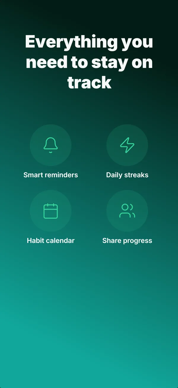
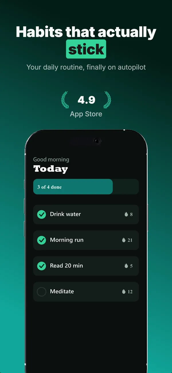
What is the feature grid layout?
The feature grid layout drops the device and fills the frame with a headline above a 2x2 or 2x3 grid of icon-and-label tiles, one short feature per tile. Its narrative job is educate, and specifically depth: it answers the comparison shopper who wants to confirm a particular capability exists before installing. Because it carries no UI and reads as dense, it belongs later in a set, after the hook and the first feature explanations have done their work; the builder keeps it out of the first three frames for exactly that reason. Use feature grid as a recap or a breadth signal for multi-feature apps (utilities, productivity suites, all-in-one tools) where the install decision hinges on coverage rather than a single hero feature. Keep each label to a few words and each icon legible, because the grid only earns its place if every tile reads at thumbnail size.
Layout spec
- Narrative job
- Educate
- Device mockup
- No
- Works in frames (of 5)
- 12345
- Renders
- Feature gridStar rating
Read from the builder engine: the narrative job, device, valid frame positions, and trust signals this layout actually renders.
When to use this layout
Use feature grid once a set has hooked and educated, when the remaining job is to prove breadth. If you have one feature to explain, a text-top device layout lands harder. Cap the grid at six tiles; past that, nothing reads at thumbnail scale. It is the wrong choice for frame 1, where it has no hook.
Best for
- Frame 4 or later, as a depth or recap frame
- Multi-feature apps where breadth is the selling point
- Confirming specific capabilities for high-intent comparison shoppers
- Utilities and suites with four to six discrete features worth listing
Common pitfalls
- Placing it in the first three frames, where dense text has no hook
- Cramming more than six tiles, which collapses legibility
- Vague labels that could describe any app ("Powerful", "Smart")
Generate a feature grid screenshot
Describe your app, and the builder generates a frame in this layout. No design decisions, just finished output.
Get screenshotsRelated layouts
educate
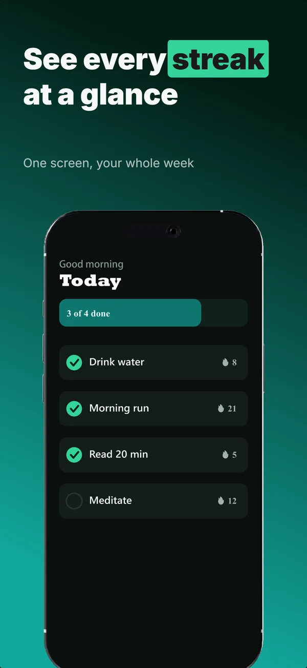
Text-Top Device-Bottom
Headline at the top, flat device anchored at the bottom. The default educate layout for frames 2 and 3 where feature explanation has to land before the scroll-off point.
educate
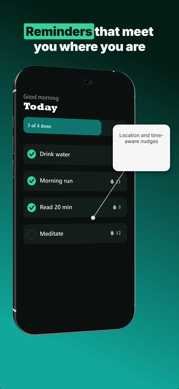
Annotated Feature
A tilted device with a side callout chip linked by a connector line. The educate layout for pointing at one specific feature.
educate
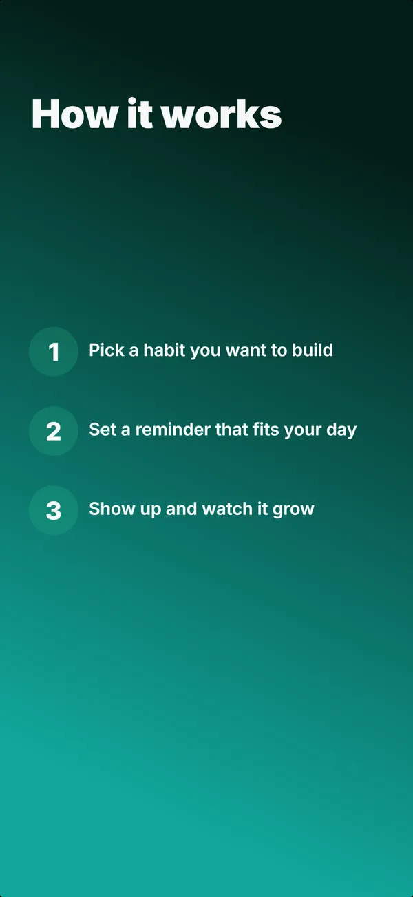
Step Flow
A headline above three numbered steps, no device. The "how it works" layout for apps where onboarding clarity sells.
hook
Device Hero
Centered flat device with a strong headline above. The product-forward hook layout: frame 1 is the one screenshot almost every App Store visitor sees before deciding.
Want the full set strategy?
Read the 7 layouts that convert in 2026 guide