Step Flow Layout
A headline above three numbered steps, no device. The "how it works" layout for apps where onboarding clarity sells.
Try this layout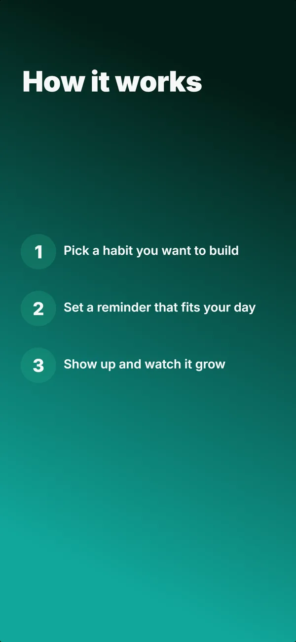
What is the step flow layout?
The step flow layout drops the device and lists three short numbered steps under a headline, the "how it works" frame. Its narrative job is educate: it removes the "is this complicated?" worry by showing the whole path in one glance. Because it is text-dense and carries no UI, it belongs later in a set, after the hook; the builder keeps it out of the first three frames. Use step flow when ease of getting started is part of the pitch (onboarding-light tools, habit and routine apps, anything where users fear setup friction). Three steps is the sweet spot: enough to feel complete, few enough to read instantly. Keep each step to a short action phrase ("Pick a habit", "Set a reminder"), and make sure the sequence reads as genuinely simple, because the entire point of the layout is to make the app feel effortless to start.
Layout spec
- Narrative job
- Educate
- Device mockup
- No
- Works in frames (of 5)
- 12345
- Renders
- Numbered steps
Read from the builder engine: the narrative job, device, valid frame positions, and trust signals this layout actually renders.
When to use this layout
Use step flow when getting started easily is a selling point and you can express it in three short steps. If your value is the output rather than the process, a device or stats layout fits better. Keep it to three or four steps; more makes the app look harder to start, which defeats the purpose.
Best for
- Frame 4 or later, the "how it works" explanation
- Apps where low setup friction is part of the pitch
- Onboarding-light tools, habit, and routine apps
- Removing the "is this complicated?" objection before install
Common pitfalls
- Using it in the first three frames, where dense text has no hook
- Listing more than four steps, which makes setup look harder
- Steps written as features instead of plain actions
Generate a step flow screenshot
Describe your app, and the builder generates a frame in this layout. No design decisions, just finished output.
Get screenshotsRelated layouts
educate
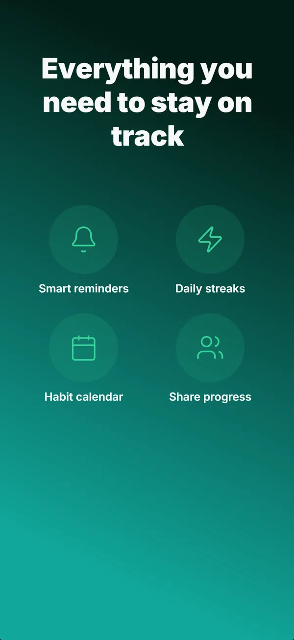
Feature Grid
A 2x2 or 2x3 grid of icon-and-label tiles, no device. The depth layout for showing four to six features in one frame.
educate
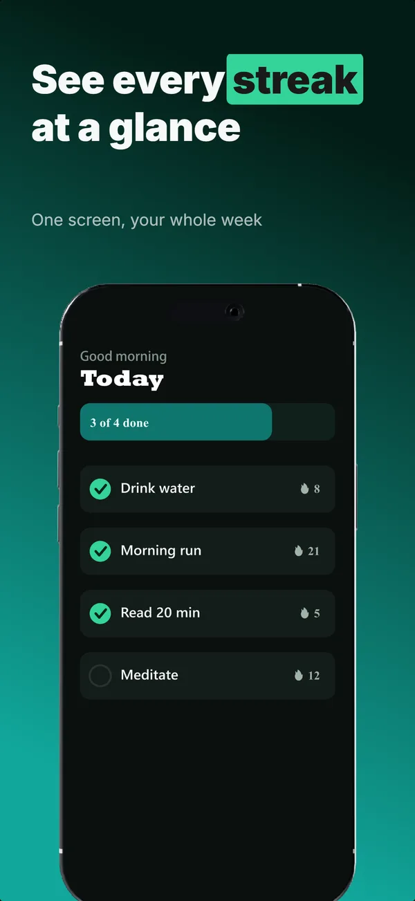
Text-Top Device-Bottom
Headline at the top, flat device anchored at the bottom. The default educate layout for frames 2 and 3 where feature explanation has to land before the scroll-off point.
educate
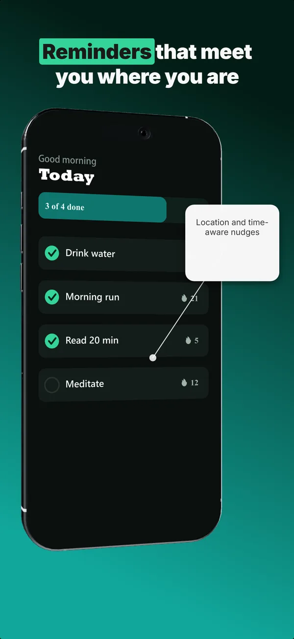
Annotated Feature
A tilted device with a side callout chip linked by a connector line. The educate layout for pointing at one specific feature.
hook
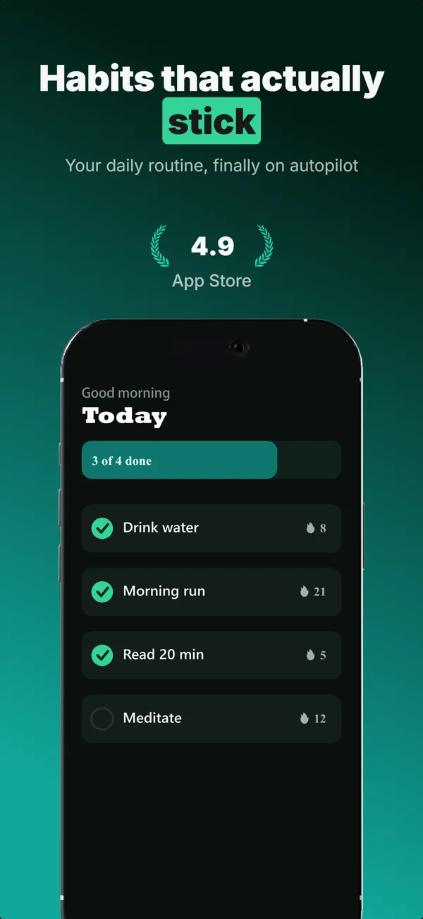
Device Hero
Centered flat device with a strong headline above. The product-forward hook layout: frame 1 is the one screenshot almost every App Store visitor sees before deciding.
See it in a full set, or get the strategy: