Text-Top, Tilted Device Layout
Headline at the top, device rotated 15-30 degrees for dimensional depth. Same educate role as text-top-device-bottom, but adds visual energy.
Try this layout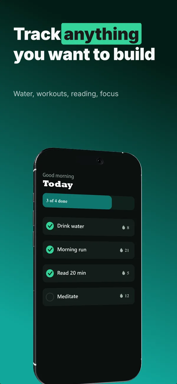
What is the text-top tilted layout?
The text-top, tilted device layout uses the same headline-above-device structure as text-top-device-bottom, with the device rotated 15 or 30 degrees instead of placed flat. The tilt adds dimensional energy without changing the underlying narrative job (educate). The trade-off: tilted devices feel more designed and less utilitarian, but they slightly reduce the legibility of fine UI text inside the screen content. Use the tilted variant when the app category benefits from a designed-template feel (lifestyle apps, creative apps, games) and the screen content survives the rotation. Skip the tilt when the in-app UI has small text or precise pixel alignment matters (finance, data dashboards, utilities).
Layout spec
- Narrative job
- Educate
- Device mockup
- Yes
- Works in frames (of 5)
- 12345
- Renders
- Star ratingLaurel statStat row
Read from the builder engine: the narrative job, device, valid frame positions, and trust signals this layout actually renders.
When to use this layout
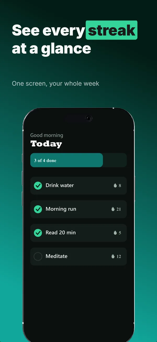
Pick the tilted variant when the brand frame is more design-forward than developer-pragmatic. For utility apps where the UI is the selling point, flat reads cleaner. For visual apps where the brand asks for premium-design feel, tilted reads more polished. Mix tilts within a set carefully: alternating tilt-direction every frame can feel chaotic; consistent tilt-direction reads as intentional.
Best for
- Lifestyle, creative, and game apps where designed-template feel matters
- Frames in positions 2 and 3 where you want visual variety from a flat frame 1
- Apps with bold UI that survives a 15-30 degree rotation
- Sets where every frame uses devices and the eye needs rotation variety
Common pitfalls
- Tilting at angles steeper than 30 degrees, which makes the screen content unreadable at thumbnail scale
- Mixing tilt directions randomly across the gallery, which fights the eye instead of guiding it
- Using tilt on frames where the in-app UI has small text that gets warped
Generate a text-top tilted screenshot
Describe your app, and the builder generates a frame in this layout. No design decisions, just finished output.
Get screenshotsRelated layouts
educate
Text-Top Device-Bottom
Headline at the top, flat device anchored at the bottom. The default educate layout for frames 2 and 3 where feature explanation has to land before the scroll-off point.
hook
Device Hero
Centered flat device with a strong headline above. The product-forward hook layout: frame 1 is the one screenshot almost every App Store visitor sees before deciding.
educate
Text-Top Tilted
Headline at the top, device rotated 15-30 degrees for dimensional depth. Same educate role as text-top-device-bottom, but adds visual energy.
See it in a full set, or get the strategy: