Text-Top, Device-Bottom Layout
Headline at the top, flat device anchored at the bottom. The default educate layout for frames 2 and 3 where feature explanation has to land before the scroll-off point.
Try this layout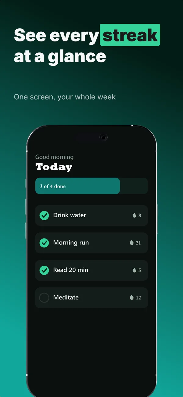
What is the text-top device-bottom layout?
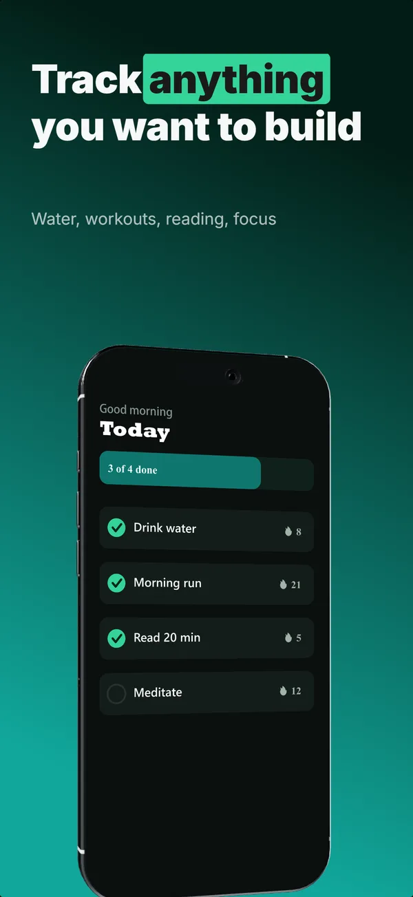
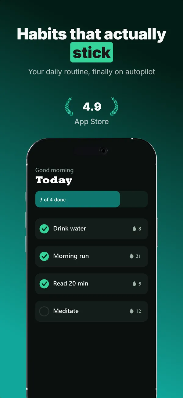
The text-top, device-bottom layout splits the frame vertically: a headline (and optional subtitle) occupies the top third, and a flat or near-flat device fills the bottom two-thirds. This split is the most common educate-job pattern in App Store screenshots because it lets you state what a feature does in text first, then show the feature in the UI. The eye reads top-to-bottom by default, so the message lands before the visual confirms it. Use this layout for frames 2 and 3 where you have one feature to explain per frame. Top-of-frame is also the first text the eye reads, so the single benefit you most want to land belongs in the headline here, not buried in the device screen.
Layout spec
- Narrative job
- Educate
- Device mockup
- Yes
- Works in frames (of 5)
- 12345
- Renders
- Star ratingLaurel statStat row
Read from the builder engine: the narrative job, device, valid frame positions, and trust signals this layout actually renders.
When to use this layout
Use text-top on educate-job frames in the middle of the set (positions 2 and 3 of a 5-frame set). If frame 1 is device-hero, this layout is the natural progression: hook with the product, then educate with feature breakdown. If your subtitle and feature names are short (under 6 words), this layout reads cleanly at thumbnail scale.
Best for
- Frame 2 and 3 where one feature gets explained per frame
- Apps where the feature name and UI need to land in the same glance
- Frames where the benefit must read clearly at thumbnail scale (top text stays most legible)
- Multi-feature apps where each frame explains a different capability
Common pitfalls
- Squeezing more than 8 words into the headline area, which loses thumbnail legibility
- Using middle-of-frame text overlay on the device area, which competes with the UI text and muddies both
- Forgetting that frames 2 and 3 still need to work without context from frame 1
Generate a text-top device-bottom screenshot
Describe your app, and the builder generates a frame in this layout. No design decisions, just finished output.
Get screenshotsRelated layouts
educate
Text-Top Tilted
Headline at the top, device rotated 15-30 degrees for dimensional depth. Same educate role as text-top-device-bottom, but adds visual energy.
hook
Device Hero
Centered flat device with a strong headline above. The product-forward hook layout: frame 1 is the one screenshot almost every App Store visitor sees before deciding.
educate
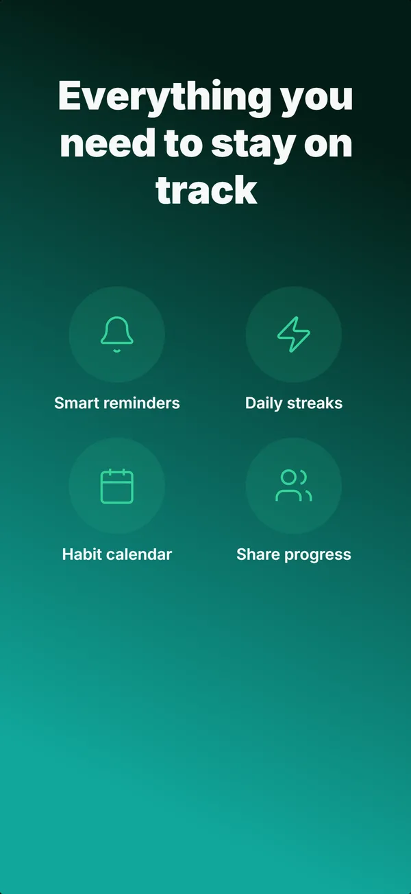
Feature Grid
A 2x2 or 2x3 grid of icon-and-label tiles, no device. The depth layout for showing four to six features in one frame.

prove
Social Proof
Star rating, customer quote, and laurel-wrapped stats, no device. Built for the prove job: credibility lands by frame 3, the last screenshot the App Store shows in search results.
See it in a full set, or get the strategy: