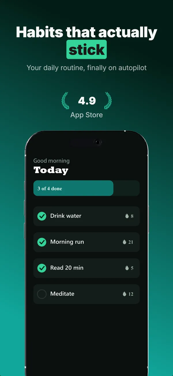
Social Proof Layout
Star rating, customer quote, and laurel-wrapped stats, no device. Built for the prove job: credibility lands by frame 3, the last screenshot the App Store shows in search results.
Try this layout
What is the social proof layout?
The social proof layout stacks three trust signals (star rating, customer quote, laurel-wrapped stats) on a clean background with no device. Its narrative job is prove: it tells the viewer "other people already validated this app." The App Store shows up to three screenshots in search results, and StoreMaven's eye-tracking puts the median visitor at roughly 2.4 screenshots viewed, so frame 3 is the last credibility moment most browsers reach. Subscription apps in particular benefit from social proof at frame 3 because the install decision sits adjacent to a paywall commit decision, and external validation reduces the perceived risk of both. Use this layout once per set, in position 3 of 5+ frame sets.
Layout spec
- Narrative job
- Prove
- Device mockup
- No
- Works in frames (of 5)
- 12345
- Renders
- Star ratingCustomer quoteLaurel stat
Read from the builder engine: the narrative job, device, valid frame positions, and trust signals this layout actually renders.
When to use this layout
Use social-proof in position 3 of the gallery when you have real trust signals to show. If your app has fewer than 100 reviews, the star rating signal is weaker than the absence of proof would be (an empty rating chip reads worse than no rating chip). Wait until you have meaningful social proof before this layout earns its slot. The quote attribution should be a real user; fabricated quotes get flagged by Apple Review.
Best for
- Frame 3 of 5+ frame sets, the credibility moment before scroll drop-off
- Subscription and paywall-gated apps where install commitment is high
- Apps with measurable social proof (real star count, real reviews, real stats)
- B2B and prosumer tools where validation reduces switching cost objections
Common pitfalls
- Using fabricated review quotes or star ratings, which triggers App Store Review rejection
- Pushing social-proof to frame 5+ where the audience that needed it already left
- Combining 4+ proof signals on one frame (stars + quote + stat row + laurel + badge), which dilutes each signal
Generate a social proof screenshot
Describe your app, and the builder generates a frame in this layout. No design decisions, just finished output.
Get screenshotsRelated layouts
hook
Device Hero
Centered flat device with a strong headline above. The product-forward hook layout: frame 1 is the one screenshot almost every App Store visitor sees before deciding.
prove
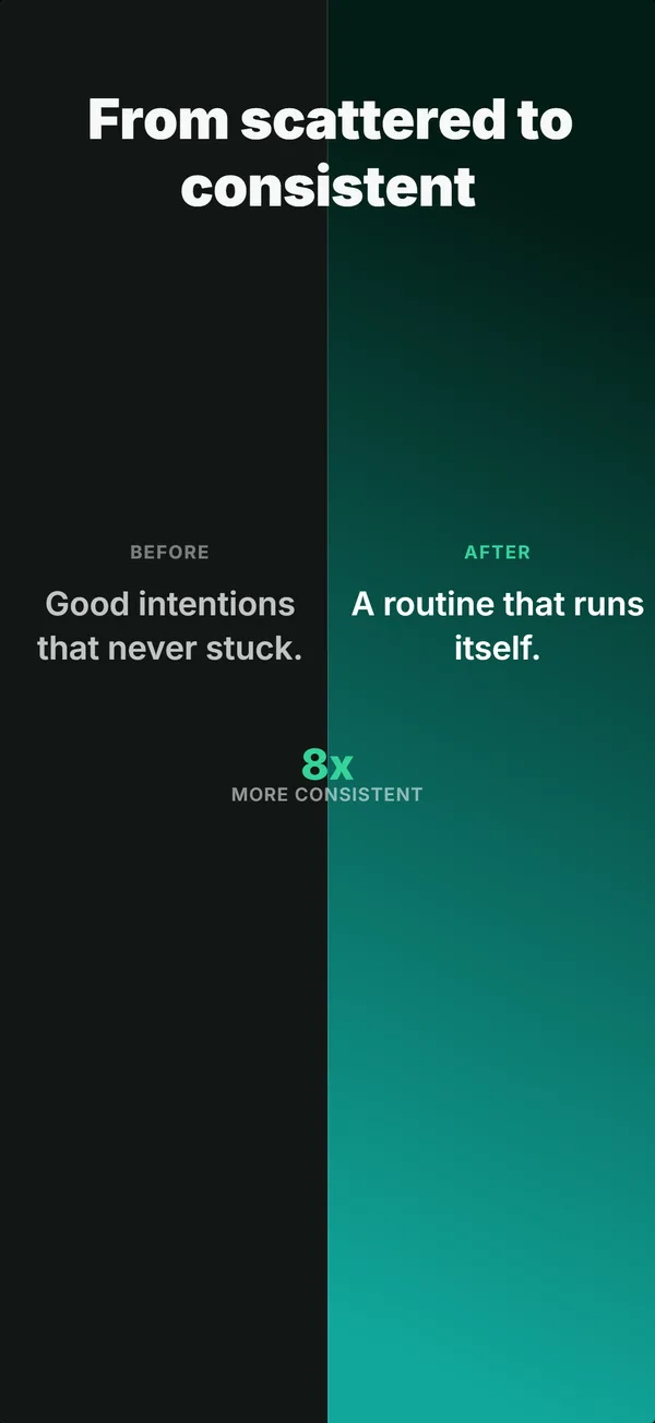
Before / After
Split frame: dark before-half on the left, bright after-half on the right. The prove layout for transformation apps where the gap is the value.
prove
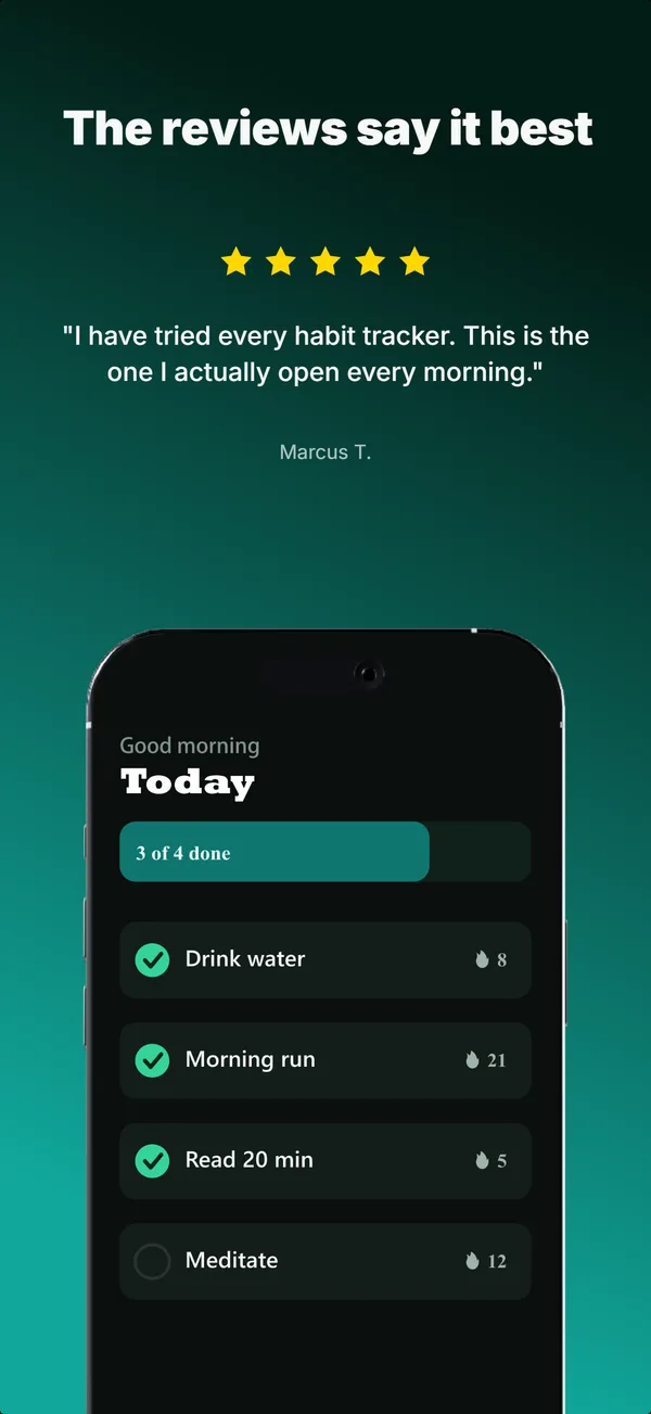
Review Clip
A star rating and a real customer quote above a bottom-clipped device. The prove layout that pairs a testimonial with the product in one frame.
prove
Metric Badge
A centered device with a chunky achievement-card badge over its upper screen. The prove layout when one number is the whole story.
See it in a full set, or get the strategy: