Before-After Layout
Split frame: dark before-half on the left, bright after-half on the right. The prove layout for transformation apps where the gap is the value.
Try this layout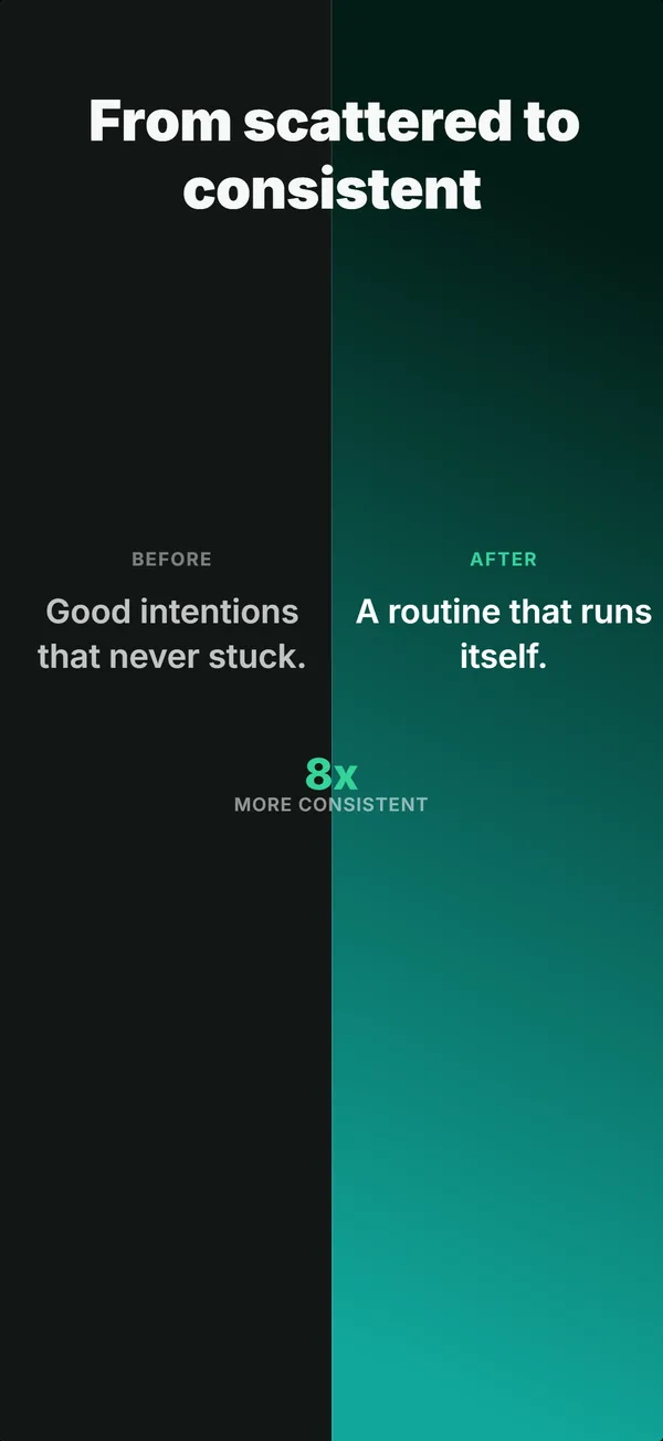
What is the before / after layout?
The before-after layout splits the frame into two halves: a dark, dim, or cluttered "before" state on one side and a bright, clean, or improved "after" state on the other. The contrast itself is the message. There is no device in the layout because the transformation is the product. Use it for apps that solve a measurable problem (cleanup utilities, photo editors, organization tools, productivity apps that reduce clutter). The prove job lands here because the audience doesn't have to imagine the improvement: they see it directly. Skip if the app delivers an ongoing experience rather than a one-shot transformation.
Layout spec
- Narrative job
- Prove
- Device mockup
- No
- Works in frames (of 5)
- 12345
- Renders
- Before / after split
Read from the builder engine: the narrative job, device, valid frame positions, and trust signals this layout actually renders.
When to use this layout
Use before-after when the app's value is a state change the user can see in a single image. The split must be honest: if the "after" exaggerates beyond what users actually achieve, App Store Review will flag it as misleading. Works best in frame 3 alongside a device-hero frame 1 and an educate frame 2.
Best for
- Cleanup and organization apps where the before state is visually messy
- Photo and video editors where the transformation is the product
- Productivity tools that reduce visible clutter (inbox zero, file organizers)
- Frame 3 of sets where you want a high-impact prove moment
Common pitfalls
- Exaggerating the "after" beyond what users actually achieve (misleading content violation)
- Using before-after when the app delivers an ongoing experience, not a transformation
- Splitting the frame top-to-bottom instead of left-to-right, which fights Western reading order
Generate a before / after screenshot
Describe your app, and the builder generates a frame in this layout. No design decisions, just finished output.
Get screenshotsRelated layouts

prove
Social Proof
Star rating, customer quote, and laurel-wrapped stats, no device. Built for the prove job: credibility lands by frame 3, the last screenshot the App Store shows in search results.
hook
Stats Hero
Giant centered stat or number, no device. The hook layout when the metric itself is the selling point: 1M users, 10K reviews, 4.8 stars.
prove
Metric Badge
A centered device with a chunky achievement-card badge over its upper screen. The prove layout when one number is the whole story.
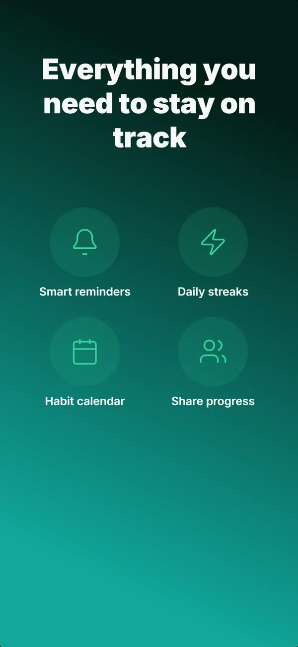
educate
Feature Grid
A 2x2 or 2x3 grid of icon-and-label tiles, no device. The depth layout for showing four to six features in one frame.
See it in a full set, or get the strategy: