Metric Badge Layout
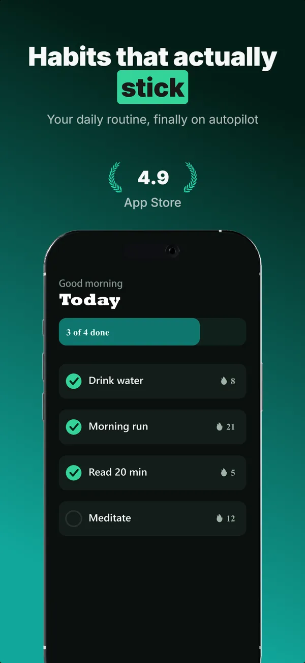
A centered device with a chunky achievement-card badge over its upper screen. The prove layout when one number is the whole story.
Try this layoutWhat is the metric badge layout?
The metric badge layout centers a device and lays a chunky, high-contrast achievement card over the upper part of its screen, holding a single number: a streak, a rating, a saved total, a milestone. Its narrative job is prove: the badge turns an abstract claim into a concrete, glanceable figure sitting right on the product. It works because a number is processed faster than a sentence, and pinning it to the device keeps the proof attached to the app rather than floating as marketing. Use metric badge in a credibility slot when one metric is genuinely your strongest argument and you want it tied to the UI. Keep the value to a short number rather than a phrase so the badge stays readable at thumbnail scale, and only show a figure you can substantiate, because inflated or invented metrics are an App Store Review risk and erode the trust the layout exists to build.
Layout spec
- Narrative job
- Prove
- Device mockup
- Yes
- Works in frames (of 5)
- 12345
- Renders
- Laurel stat
Read from the builder engine: the narrative job, device, valid frame positions, and trust signals this layout actually renders.
When to use this layout
Use metric badge when one number beats any sentence you could write and you want it on the device. If you have several stats, stats hero or a stat row fits better; if you have a quote, review clip does. Keep the badge value to a short number, never a phrase, or it overflows the card.
Best for
- Credibility frames where one metric is the strongest proof
- Apps with a single standout number (streak, rating, savings, milestone)
- Tying an abstract benefit to a concrete, glanceable figure
- Subscription apps reinforcing value next to the product
Common pitfalls
- Putting a long phrase in the badge, which overflows and breaks the layout
- Showing an inflated or unverifiable metric (App Store Review risk)
- Letting the badge cover the most important part of the screen
Generate a metric badge screenshot
Describe your app, and the builder generates a frame in this layout. No design decisions, just finished output.
Get screenshotsRelated layouts
hook
Stats Hero
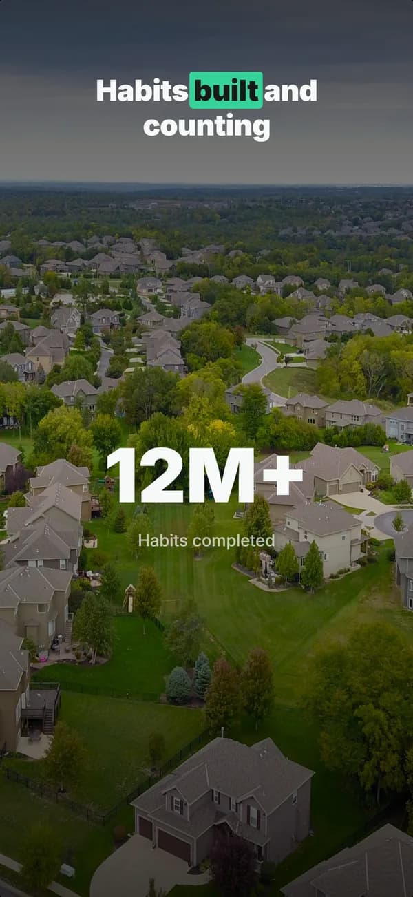
Giant centered stat or number, no device. The hook layout when the metric itself is the selling point: 1M users, 10K reviews, 4.8 stars.

prove
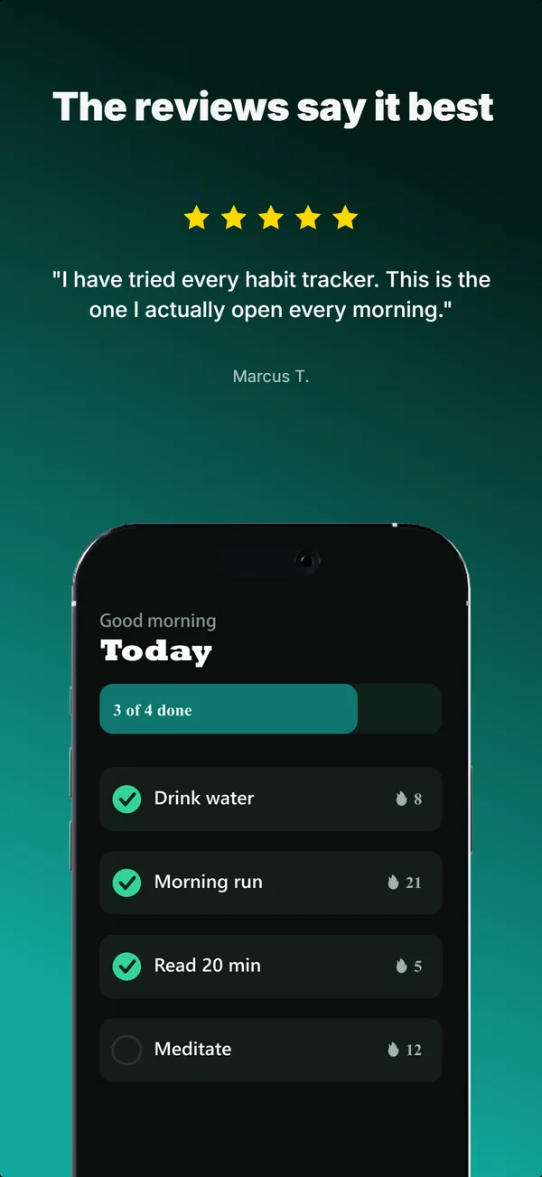
Social Proof
Star rating, customer quote, and laurel-wrapped stats, no device. Built for the prove job: credibility lands by frame 3, the last screenshot the App Store shows in search results.
prove
Review Clip
A star rating and a real customer quote above a bottom-clipped device. The prove layout that pairs a testimonial with the product in one frame.
hook
Device Hero
Centered flat device with a strong headline above. The product-forward hook layout: frame 1 is the one screenshot almost every App Store visitor sees before deciding.
See it in a full set, or get the strategy: