Hindi
App Store Screenshots
Translate your set into Hindi without rebuilding the layout. Locale hi, captions run 10 to 20% longer than English, set in Noto Sans Devanagari.
2,205 screenshots designed here so far


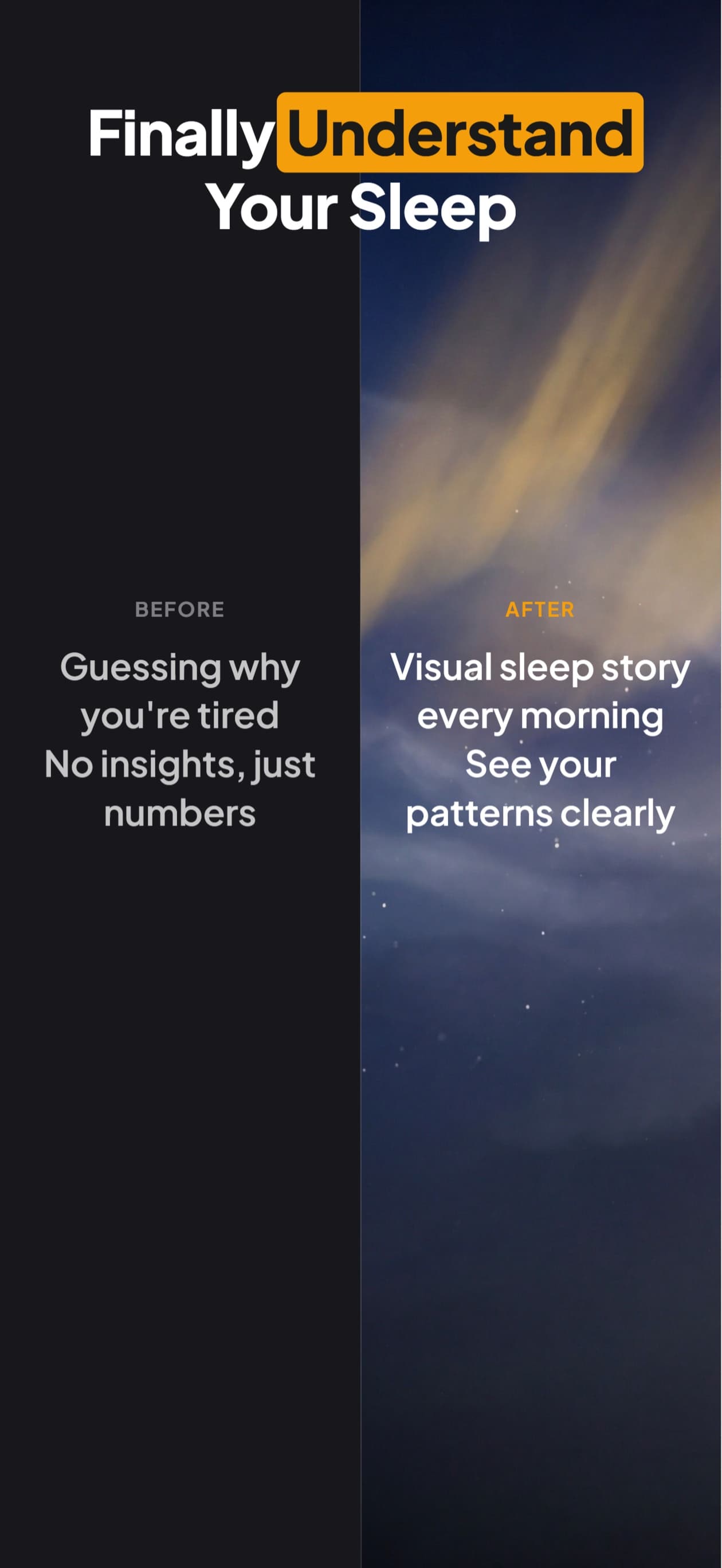
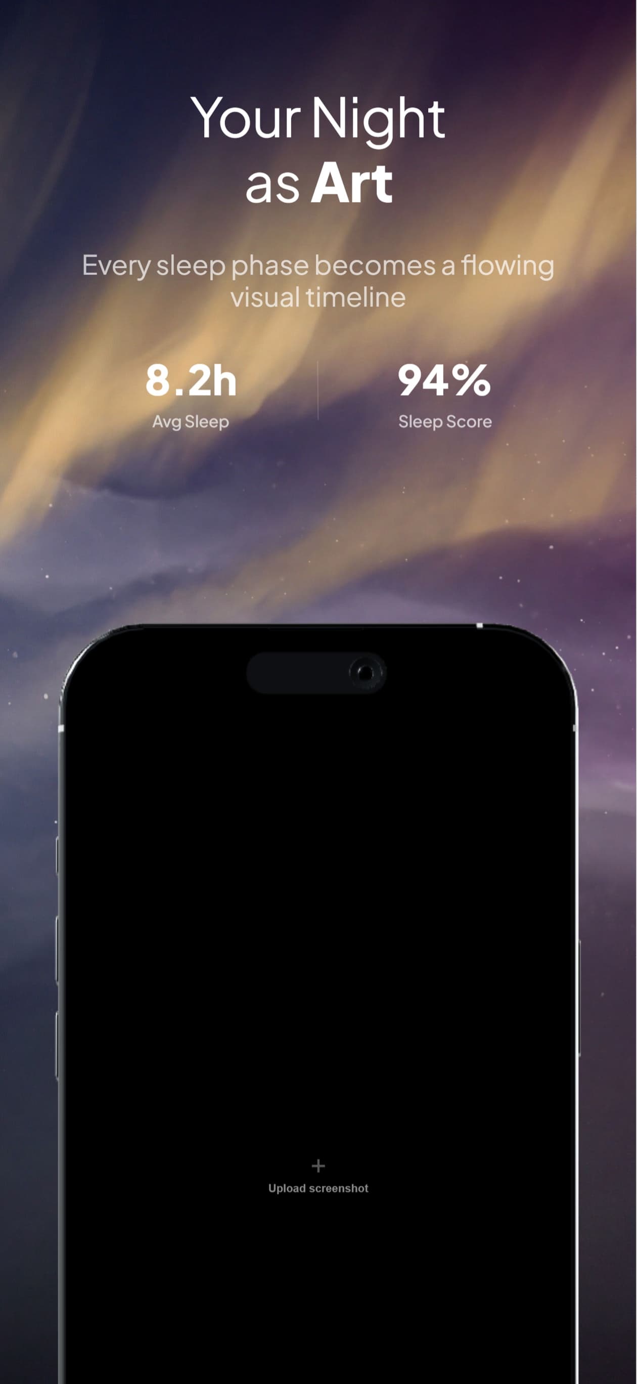
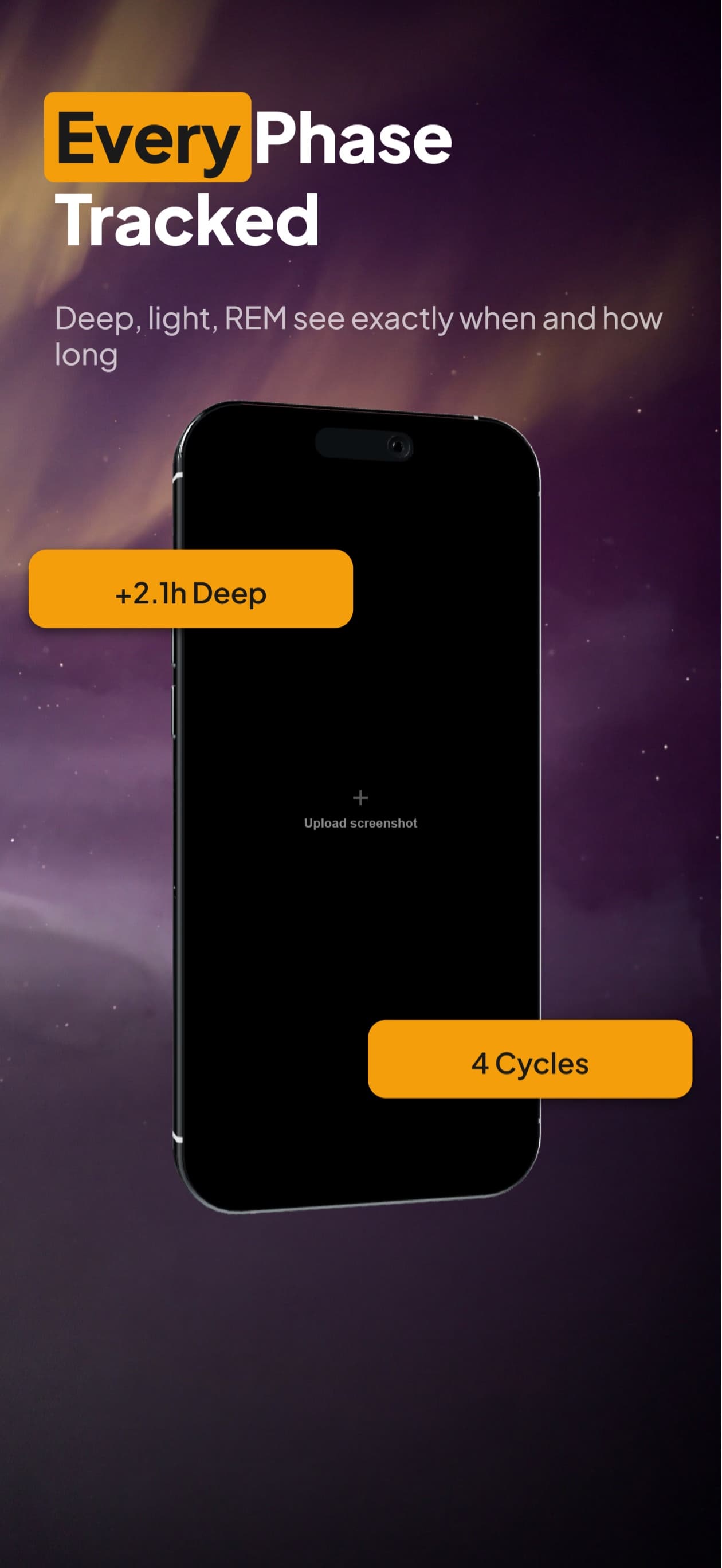
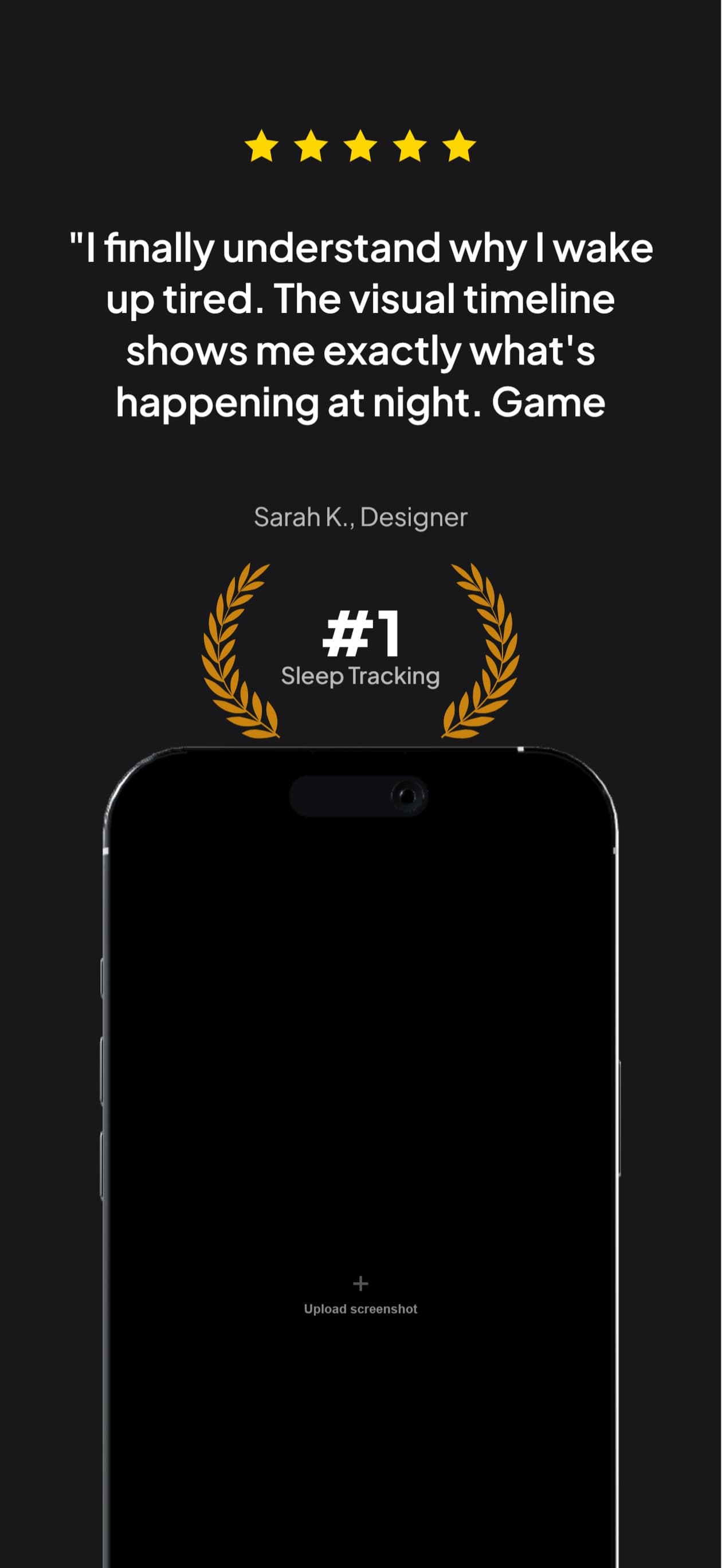
The same five-frame set, rendered in Hindi. Real output from the pipeline, not a mockup of one.
हिन्दी
India is the largest App Store market by download volume and among the smallest by revenue per user, so Hindi is a reach play rather than a revenue play. Urban India reads English comfortably, which is why so many listings skip Hindi; the audience it actually adds is the tier-2 and tier-3 user who bounces off an English screenshot.
India.
A translator returns a spreadsheet of strings.You get finished frames.
What breaks in Hindi
Hindi runs modestly longer than English in width, but the number that actually breaks layouts is height, not width. Vowel signs stack above and below the base letter, so a Devanagari line occupies more vertical space than its font size suggests. A caption box measured on English metrics clips the top matra first, which reads as a typo rather than as a layout bug.
The i-matra (ि) is typed after its consonant but renders before it, so truncating a Hindi caption by character count can reorder the word it cuts
Devanagari draws a connecting headline stroke (shirorekha) across the top of a word, and letter-spacing severs it into disconnected fragments
Vowel signs stack above and below, so the real line box is taller than the font size implies and the top matra clips first
Conjuncts fuse two or three consonants into one glyph, so character count is a poor proxy for rendered width
You type. The canvas builds.
Describe your app, see your first set, then ask for Hindi. The layout survives the language change because you are editing the same set, not starting a new one.

AppScreenshotStudio
AppScreenshotStudio
AppScreenshotStudio
AppScreenshotStudio
Hindi sets, handled
Vowel signs and the virama are measured at zero width, because that is what they advance, so Hindi captions are not over-wrapped
Noto Sans Devanagari rendering verified in exported pixels, no tofu boxes and no dotted-circle placeholders
Conjuncts stay intact across a line break instead of splitting a mark from the letter it belongs to
The same set you built in English, retranslated in chat without rebuilding the layout
Exports at the exact dimensions App Store Connect requires for the hi localization
Questions & Answers
Is Hindi worth localizing if my Indian users read English?
It depends which Indian users you mean. English reading comfort in metro India is high, so a Hindi listing adds little there. It adds most where English confidence drops, which is also where App Store growth is fastest. If your install base is already concentrated in Mumbai and Bangalore, Hindi is optional; if you are trying to widen past them, it is the cheapest widening available.
Why does my Hindi caption look cut off at the top?
Almost always a line box measured on Latin metrics. Devanagari stacks vowel signs above the base letter, so the glyph extends higher than an English cap height. A box that fits "Track your habits" exactly will shave the top matra off the Hindi translation. Our engine measures the stacked height rather than assuming the Latin one.
Can I letter-space a Hindi headline the way I would an English one?
No, and this is the mistake most design tools make silently. Devanagari joins letters under a continuous headline stroke. Adding tracking cuts that stroke into pieces and the word stops reading as a word. We drop letter-spacing for Devanagari rather than applying the value you set for the English version.
What font do Hindi captions render in?
Noto Sans Devanagari, loaded as a real webfont in both the browser preview and the headless export, so the two cannot disagree. We do not rely on whatever Devanagari font the rendering machine happens to have installed, which is how screenshots end up with tofu boxes in one export and correct text in another.
Hindi screenshots,
handled.
Try AppScreenshotStudio. 14-day trial with 25 credits. Card required, cancel anytime before it ends.
Start your trial